Viz Pilot User Guide
Version 8.5 | Published December 16, 2019 ©
Additional Components
Additional components are components with more specialized properties and features. Additional components are not used as much as standard components.
This section contains the following topics:
Wrap Fixed Unicode Memo Component

This component is much like the Unicode Memo. However, there is a significant difference between the two. As the Unicode Memo stores its text as a list of strings, the Wrap Fixed Unicode Memo saves the text in the UTF8Text string property as one long text string. This avoids the problem of line breaks being added to the text provided that WordWrap is disabled. Line breaks added by the user are not removed.
TrackBar Component

The TrackBar represents a position along a continuum using a slider and, optionally, tick marks. A track bar can also display a selected range and set minimum and maximum values. The selected range is marked by triangular ticks at the starting and ending positions of the selection.
Notable Properties
-
Max: Specifies the maximum size of an interval.
-
Min: Specifies the minimum size of an interval.
-
SelEnd: Specifies the position of the end point of the selection range.
-
SelStart: Specifies the position of the starting point of the selection range.
-
Position: Contains the current position of the slider.
Mask Edit Component

Allows a user to enter and edit data, similar to an edit component, but provides a means to specify particular formats, such as a postal code or phone number. Mask Edit shares the properties of other Text controls.
Notable Properties
-
EditMask: Specifies the characters a user can enter into the masked edit control to valid characters and formats.
-
Text: Contains the formatted text based on the mask set by the EditMask property.
Speed Button Component

Use SpeedButton to add a button to a group of buttons in a form. SpeedButton introduces properties that can be used to set graphical images that represent the different button states (selected, unselected, disabled and so on). Use other properties to specify multiple images or to rearrange the images and text on the button.


SpeedButton also introduces properties that allow speed buttons to work together as a group. Speed buttons are commonly grouped in panels to create specialized tool bars and tool palettes.
Notable Properties
-
GroupIndex: Buttons with the same property value (other than 0), work together as a group and can present mutually exclusive choices to the user.
Script Example
Sub InitForm SpeedButton1.Color = clGray SpeedButton2.Color = clRed End Sub Sub SpeedButton1Click(Sender) SpeedButton1.Color = clLime SpeedButton2.Color = clGray End sub Sub SpeedButton2Click(Sender) SpeedButton1.Color = clGray SpeedButton2.Color = clRed End subDateTime Picker Component
![]()
The DateTime Picker component is used for entering dates or times. In dmComboBox date mode, DateTime Picker resembles a list box or combo box, except that the drop-down list is replaced with a calendar illustration. Users can select a date from the calendar. Dates or times can also be selected by scrolling with the Up and Down arrows and by entering text. Use the .Date and .Time property to access the selected date/time from script.
Notable Properties
-
Date: Indicates the date entered by the user.
-
DateFormat: Determines whether the date format is long or short.
DateMode: Can be used with a drop-down calendar or by the Up/Down arrows with which the user can adjust the date. (Applies only when Kind is dtkDate.) -
Kind: Determines if date or time is shown.
-
Time: Indicates the time entered by the user.
Timer Component
![]()
Use the Timer component to trigger an event after a measured interval. Enter the code that is to occur at the specified time inside the timer component’s OnTimer event.
Notable Properties
-
Interval: Determines how frequently the OnTimer event occurs. Specified in milliseconds. Default is 1000 (one second)
-
Enabled: Determines if the timer is active or not. The OnTimer event only occurs when the Enabled property is True.
Script Example
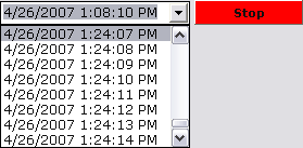
The Timer event gets called at the interval specified (1000 = 1 second) and the current date and time is set in a text box.

When the template is loaded it will be in Start mode.
Sub Initform Timer1.Enabled = False TWColorButton1.Color = clLime TWColorButton1.Caption = "Start" End Sub

When started, the Timer1Timer event adds the time Now to the combo box.
Sub Timer1Timer(Sender) TWUniComboBox1.Items.Add(Now) End sub

When the button is clicked, it either sets Timer1 to true or false, and at the same time changes color and caption.
Sub TWColorButton1Click(Sender) if (Timer1.Enabled = True) Then Timer1.Enabled = False TWColorButton1.Color = clLime TWColorButton1.Caption = "Start" Else Timer1.Enabled = True TWColorButton1.Color = clRed TWColorButton1.Caption = "Stop" End If End sub